Gift Away
UX Research and Design- Double Diamond Process
Context
Research Question: "How might we help low-income persons struggling to acquire home goods and other furnishings"?
Duration: August 2023 - December 2023
Class: SI 482- Interaction Design Studio
Tools: Figma, Figjam, user surveying
Role: UX researcher and designer
From ideation to delivering this project focused on responding to the CHI 2024 student design competition. The goal was to design a solution to a problem within the 17 sustainable and developmental goals outlined by the united nations. This class aimed to create an end product by going through the double diamond process of discover, design, develop, and deliver. Working on a team of 6 UX majors, we worked together to create a solution to answer our research question.
01
Discover
Primary Research- Competative Analysis
In our primary research we started off conducting a competitive analysis of existing services that are used in our problems pace. First we started off with a feature comparison chart, following up with a more in-depth competitive analysis shown below. Both images can be seen in a pdf document linked below. This analysis helped us understand our role in the problem space and how we can create a unique solution.


Primary Research- User interviews
Following the competitive analysis we conducted, 10 user interviews. Discovering themes, and similarities between these interviews and applying them towards our secondary research. We screened our interviewees to interview those of lower income or those who have moved recently. In our initial research we discovered that these two groups would be most affected by our problem statement. However, this demographic was to be further clarified in our later development of personas.
My interview questions were largely based around discovering more about users feelings with second hand goods, interactions with strangers. Along with this, I thought it was important to understand users' behavior in daily life regarding items they no longer use or need. These questions were based aroudn the spaces we found during our competitive analysis.
From the interviews I conducted I found 4 key takeaways:
-
Users first priority is to re-use or keep items that are useful to them, especially when moving.
-
Users find discarding items in the garbage easier and more convenient than donating.
-
Users are very comfortable with second hand sellers.
02
Define
Personas
Moving from the discover phase we moved towards narrowing down the problem and solution. This started by creating personas. Our team used interview data to build personas for primary, secondary, and tertiary users.
Each persona has unique wants or needs related to the problem statement.
-
Persona Primary 1: Low-income parents - Krysta
-
Persona Primary 2: People with homegoods they don’t need - Jim
-
Persona Secondary: Leaving home / short-term housing - Alice
-
Persona Tertiary: I get a thrill out of finding a bargain and shopping - Edna


Storyboards
From the personas our team worked to create scenarios followed by storyboards. First outlining them and then creating high fi deliverables.

Scenario 1: Krysta
-
Kids had a growth spurt, don’t fit in beds
-
Family budget is tight
-
Krysta’s husband doesn't want to shop
-
Krysta is shopping online without results - frustrated
-
Krysta having relationship issues
-
Children continue to complain
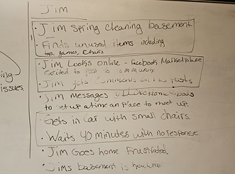
Scenario 2: Jim
-
Jim cleaning
-
Jim posts on Marketplace
-
Jim messages @Ilovehomegoods and sets a time and place to meet
-
Arriving at the meeting point, Jim contacting Where are you??
-
Jim going home frustrated
-
Keeps items in home


Design Statement
Usable home goods are often disposed of rather than repurposed in other homes. We are hoping to bridge the gap between people with an excess of goods and those who need access through a community sharing app.
03
Develope
User flow diagram
After finding personas and storyboards we started working through all possible flows that our solution could have. We created a user flow diagram. After an initial brainstorm on micro, and conversation about user actions, we determined what pages will be present in our solution (such as signing up, homepage, posting, etc). Then we separated the tasks into different flows to be able to detail the actions that would be available and pages that we needed on figma, following a color and shape code to better understand the diagram. The in-depth diagram with a key and notes can be found in the diagram linked below.


Lowfi Prototyping
In order to gain the most out of our teams collective creativity, each team member made 32 small sketches of ideas for our preposed solution. There was no restrictions in what aspects of the solution were designed, whether that be logo, home page, interaction feature. We were really able to explore our creativity through this activity. My sketches can be seen to the right! From these sketches we found our app name and logo: Gift Away.
_1.jpg)

When making the prototypes we started off designing as many iterations as we could of the app pages. We started off deciding 3 user flows to design for, the welcome, claim, and homepage. Each flow had 5-6 screens to design for, therefore we all worked individually to create as many pages as we could. While designing we were trying to think about how all of our different personas would interact with the CTAs. Using user flow diagrams from earlier, we were able to pare down what was necessary and create screens that went with our intended user flow.
We found it difficult to keep the design low fi while still showcasing the user flow and interactions. By adding a bit more words gave clarification to what each button or text was there for, making it easier for us to understand the lo fi prototype.
The task flow on the right is the "claim item" flow. This flow requires the user to scroll through the home page, click on an item, read the description and then claim the item. This flow is one of the most important flows of our solution to the design problem therefore one we decided to focus on in this lowfi prototype.
Usability Testing: Lowfi
While performing the usability testing for our lo-fi prototype, we filled out usability defect logs in
order to make sure that we could get a detailed response about the task of claiming an item and
canceling the claim. We performed this with 4 different people in order to obtain a wide range of
defects that could occur while performing this task. The biggest concerns came from the fact
that not everything was prototyped to work, which is something that we were originally going to
work on, so it was not as concerning as the other information we were given during the testing.
Minor Issues:
-
There was a lack of clarity on the home page about the ability to scroll through the listings.
-
the user wanted to see more photos of the item without needing to click on the item
details. -
The user was not sure how to start the conversation.
Crititcal Issues:
-
The user wanted to see more details in the item description page
-
the lack of implementation of the search feature.
These issues were taken into consideration and eliminated in our high fi designing. A more in-depth usability report can be seen in the pdf linked below.

04
Deliver
Our project goal was to create a high fi interactive prototype of our app Gift Away. We quickly realize that with five members designing we needed a design system in order to maintain consistency in our app design.

After creating this design system, we divided task flows amongst our group members. We found that in our design process we had many different ideas on how we wanted the exact layout to look on some of the pages. In these scenarios, multiple iterations and decided which one was better fit for the users, aesthetically and functionally. This iterative process can be seen in the design of the gifter profile page. This ensured that each of our designs were purposeful and strategic and catered towards the user. In addition to the designing we repeated our usability testing, discovering minor design consistency issues, adjusting them accordingly in the final prototype.


The figma page linked below showcases these iterations, along with our final design. Linked below is the prototype as well as the presentation.


05
Reflection
This project was the first end to end project I have done with the double diamond design process. That being said I have learned an astronomical amount. Over the course of the semester we spent most of our time in the discover, define, and develope phase. And before this project I would not have believed that we would spend more time developing over designing. However, looking back at this project those phases were key to creating an app that solved a problem, and was catered to the specific user we wanted to target. I learned that its not enough to just have ideas, the harder part comes in defining the purpose of the app, and being able to defend its necessity in the world. Along with this I learned that design is catered around what is best and easiest for the user. While it may seem tedious the usability testing and iterations of designs are what led us to the app design we gave now. Without the iterations I would not have been able to design a prototype that accounts all of the users needs, which makes me understand why websites and apps are often always changing.
I also would like to note that this project was a team effort. My team worked really well together, playing on each others' strengths, and teaching skills when we could. This environment that fostered growth made each and every one of us into better UX designers and researchers, and I am grateful for that.